Bridgend Mobile Website Design
Putting You Business Online the Right Way.
Why it is essential to have a mobile friendly website?
 Over the past 5 year mobile usage has grown to such an extent that more web searches are carried out on a Mobile Device than on the traditional desk top computer. One of the most important things for a local business to understand is that many searches for local businesses are carried out on a mobile device. It follows that any business trying to bring in customers through their website would want it to be Mobile friendly, giving the customer the best user experience possible. Need help or advice? just fill in our Discovery form and one of the Bridgend mobile website design team will get back to you within 24 Hours.
There are 3 types of websites out there at the moment from a Mobile perspective.
1. A website which is designed primarily for a standard desk top computer, which will maintain its look even on a Mobile Device. This will make it hard to read and cause a prospective customer to scroll and zoom in in order to get the information they are seeking.
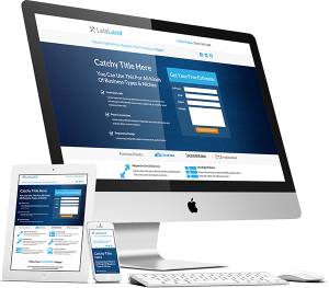
2. A Responsive website, this is a website which will adapt automatically and ensure the website retains its look and readability dependant on the size of the screen size/ mobile device it is being view on, thus giving the potential customer a much better user experience.
3. A purpose built Mobile website which your Desktop website will automatically switch to when viewed on a Mobile Device such as a smart phone or ipad. This is a website designed to give the potential mobile customer the best possible experience of your website. It is usually a simple design where the customer can access all the information simply and with ease on his mobile phone, usually with a click to call button to enable easy contact with a business.
Generally, people searching on their mobile devices locally are after specific information on the move. An eye catching but easy to view and navigate website is what’s required, one that cuts to the chase and makes it easy to find the pertinent information quickly and easily. It also gives them the opportunity to make that call without fuss and there will be a call now button right there and the front page just waiting for their thumb to tap it and contact you.
On April 21, 2015, Google released a major change to the way the search ranking algorithm worked and it was designed to give a boost to mobile-friendly pages in Google’s mobile search results. This really will effect a website’s Google Ranking if it is not taken care of, here is an excellent article be Google giving details of what they would like to see from a good website.
Google Developer – Mobile Friendly Websites Article.
If you already have an existing website try Googles own Mobile Friendly test tool, which will tell you in seconds if your website is mobile friendly.
Google Mobile Friendly Test Tool
All of the website we design at Spider Web Consulting are Mobile Responsive and we also make bespoke eye catching specific mobile website which will automatically show if your potential client is using a mobile phone. If you find your website has just failed the Google mobile friendly test just fill in our Discovery form and we will get back to you ASAP.


If you want to see if you can partner with us please complete our Discovery form and we will get back to you with information on how we can Help, No commitment and definitely no hassle and its quick and easy to fill in...
Tel:
01656 658195
Hours:
Mon - Fri: 09:00 am - 17:00 pm
Saturday Closed
Sunday Closed
email:
steve@spiderweb-consulting.com
Free Website Audit
Paste your URL below and get full in-depth SEO report and SEO tips.
© 2024 Spider Web Consulting