ON THE
BLOG
Even 5 years ago most people used their desktop PC or laptop to browse the web, since then things have changed drastically. In 2014 Mobile phone usage for web access exceeded PC usage.
What does Mobile Friendly mean for your website?
Well first let's discuss what you expect from your website, especially if you are a business and are trying to increase sales or your customer base.
There are three main things we surf the web for:- Information, Entertainment or to Buy something.
We come across many websites as we search, some you flip right by because they look cluttered and are hard to see or understand, especially when using a mobile phone.
The primary reason you have a website for is exposure, a place to show your wares and draw in new customers or clients. Your website should clearly give the information you want to put across and make it easy for the customer to find what they want.
Another Prime reason is to allow customers to contact you or make that purchase.
You don't want to put stumbling blocks in front of them or put them off by forcing them to read through huge amounts of irrelevant information on a badly formatted site.
Once you have your website how you want it to look on your desktop PC or Laptop, you now have to give some serious consideration to what it looks like on smaller devices like Tablets or Smart Phones.
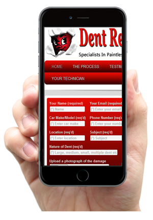
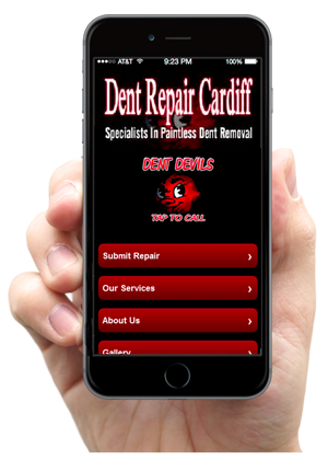
Here is a perfect example of when you might see on your mobile phone if you navigate to your website and it is not mobile friendly.


The one on the left is non friendly and the one on the right has a specifically designed mobile website which the browsers will automatically put up if it detects you are searching on a mobile phone or tablet.
As you can see the mobile friendly one looks great on a mobile and is easy to navigate by just using your thump. It gives your exactly the information you are look for in a easy to read and understand format. This really increases the likelihood of a visitor engaging with your site and making the all-important contact us call.
If your website is not Mobile friendly it is going to look bad and what's worse the major search engines (ie Google, Bing and Yahoo) are going to penalise you for it and in the future those penalties are going to get worse, the new term for this is Mobilegeddon.
Google rolled out changes on April 21st, 2015 to their algorithms that extended its use of ‘mobile-friendliness’ as a ranking factor. They have published a great article on this on the Google webmasters website, Google article on Mobile Websites.
They have also been very helpful in providing a site to test if your current website is Mobile Friendly, Pass or Fail. TEST YOU WEBSITE FOR MOBILE FRIENDLINESS HERE
Why not pop over to their site and put your web address in and find out how yours does.

There are two ways you have a Smart Phone Friendly Website and we can help.
1. Have your website design using a responsive theme. This is by far the simplest and most cost effective way to do it. It basically means your website responds to the size of the device used to view the site, it re positions all the information in an easier to read and interact with way for those smaller devices.
2. You can have a separate Mobile specific website made which will the server will automatically redirect to if it detects that a small screen device is being used. This does give you the option of giving your customer and total unique sit to view on their mobile phone. You can have some fantastic and quirky looking mobile site which might also engage better with those mobile customers.
Can Spider Web Consulting Help you go Mobile?
Here at Spiders Web Consulting we make all of our websites using mobile responsive themes, so we have got you covered in that respect but we can also make you a beautiful fully functioning mobile website as a bolt on package.
If you are on your mobile here is one we made earlier just to give you a working example.
Just click on this link on your mobile and you can see what I mean. Check out a Bespoke Mobile Website Here!
This one was added to an older website which was not mobile friendly or responsive, if you find yourself in this position we and help you. We can build you a mobile website which we can add to your server and in future all mobile customers will be redirected to your new site and Google will also notice and reward you accordingly.


No Comments
Be the first to start a conversation